One of the joys of working with Apache Flex is easy user-interface layout using horizontal and vertical groups. I haven't worked much with Xcode's interface builder and Visual Format Language looks a little bit fragile with its strange grammar, so I though it would be an interesting exercise to create my own group based layout components that mimic Flex's.
By building a hierarchy of groups, pretty much any type of layout can be constructed. In this illustration, I've mimicked the layout of the original Softimage which was a 3D modelling and animation application:
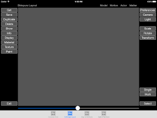
The top level group is vertically aligned: its first child being a horizontal group containing five labels, the second child is also a horizontal group containing a vertical group of buttons, then a grey 'workspace' followed by another vertical group of buttons, and the final child of the top level group is another horizontal group containing a horizontal slider.
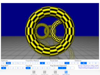
Another example is my recent depth of field demonstration:
In my original implementation, the code inside viewDidLayoutSubviews() looked like this (you may need to sit down for this):
overridefunc viewDidLayoutSubviews()
{
dofViewer.frame = CGRect(x: 20, y: 20, width: view.frame.width - 30, height: view.frame.height - 140)
let qtrWidth = (view.frame.width - 40) / 4
distanceWidget.frame = CGRect(x: 20, y: view.frame.height - 120, width: qtrWidth, height: 50).rectByInsetting(dx: 5, dy: 0)
focalSizeWidget.frame = CGRect(x: 20 + qtrWidth, y: view.frame.height - 120, width: qtrWidth, height: 50).rectByInsetting(dx: 5, dy: 0)
focalBlurWidget.frame = CGRect(x: 20 + qtrWidth * 2, y: view.frame.height - 120, width: qtrWidth, height: 50).rectByInsetting(dx: 5, dy: 0)
apertureWidget.frame = CGRect(x: 20 + qtrWidth * 3, y: view.frame.height - 120, width: qtrWidth, height: 50).rectByInsetting(dx: 5, dy: 0)
fogStartWidget.frame = CGRect(x: 20, y: view.frame.height - 60, width: qtrWidth, height: 50).rectByInsetting(dx: 5, dy: 0)
fogEndWidget.frame = CGRect(x: 20 + qtrWidth, y: view.frame.height - 60, width: qtrWidth, height: 50).rectByInsetting(dx: 5, dy: 0)
fogDensityExponentWidget.frame = CGRect(x: 20 + qtrWidth * 2, y: view.frame.height - 60, width: qtrWidth, height: 50).rectByInsetting(dx: 5, dy: 0)
creditLabel.frame = CGRect(x: 20 + qtrWidth * 3, y: view.frame.height - 60, width: qtrWidth, height: 50).rectByInsetting(dx: 5, dy: 0)
}
Not only is the code fragile and hard to understand, adding or removing components or tweaking the layout is long-winded and complicated.
Using Shinpuru Layout, I simply create a top level vertical group (SLVGroup) and two horizontal groups (SLHGroup) for the two rows of sliders:
let mainGroup = SLVGroup()
let upperToolbar = SLHGroup()
let lowerToolbar = SLHGroup()
...add the sliders to their appropriate toolbar:
let apertureWidget = LabelledSegmentedControl(items: ["f/2", "f/2.8", "f/4", "f/5.6", "f/8"], label: "Aperture")
initialiseWidget(apertureWidget, selectedIndex: 1, targetGroup: upperToolbar)
[...]
func initialiseWidget(widget: LabelledSegmentedControl, selectedIndex: Int, targetGroup: SLGroup)
{
targetGroup.addSubview(widget)
widget.selectedSegmentIndex = selectedIndex
widget.addTarget(self, action: "cameraPropertiesChange", forControlEvents: .ValueChanged)
}
...add the toolbars and the main SceneKit component (dofViewer) to the main group's children array:
mainGroup.children = [dofViewer, upperToolbar, lowerToolbar]
...and finally anchor the main group to the view's bounds:
overridefunc viewDidLayoutSubviews()
{
let top = topLayoutGuide.length
let bottom = bottomLayoutGuide.length
mainGroup.frame = CGRect(x: 0, y: top, width: view.frame.width, height: view.frame.height - top - bottom).rectByInsetting(dx: 10, dy: 10)
}
...and, voila! My Shinpuru Layout handles all the sizing itself.
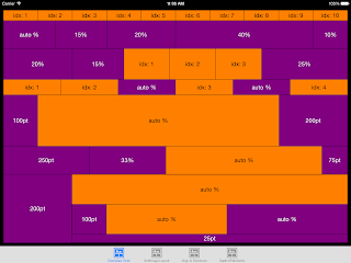
The children of Shinpuru Layout containers can be any UIView - from buttons to sliders to images. By default, these children will be evenly distributed across the width of a horizontal group or the height of a vertical group. In this example, I've added ten UILabels with an orange background to a SLHGroup and Shinpuru has sized them all to 10% of the total width:

However, if you subclass a UIView and have it implement SLLayoutItem, Shinpuru offers additional control over the widths or heights of child elements. The protocol contains two optional properties:
- percentageSize - allows the setting of the width or height as a percentage of the parent's width (for SLHGroup) or height (for SLVGroup)
- explicitSize - ignored if the percentageSize is not nil, otherwise allows the setting of the height or width in points.
Both of these properties can be left as nil to leave all the sizing to Shinpuru.
Shinpuru containers can have a mixture of SLLayoutItems with both percentage and explicit sizes and regular UIView components. In this example, a SLHGroup contains a 250 point explicitly sized SLLayoutItem, a 33% SLLayoutItem, a UILabel and a 75 point explicitly sized SLLayoutItem (the SLLayoutItems have a purple background and the UILabels have an orange background):

Nesting groups allows for more complex layouts. In this example, the second item of a SLHGroup is a SLVGroup which contains a UILabel, another SLHGroup with three additional labels and a final label with an explicit height of 25 pixels:

The code for the layout components isn't that tricky. Both the SLHGroup and SLVGroup extend a base class, SLGroup. Before the didSet observer on its children does all the maths, it removes any old components and adds the new ones as subviews:
oldValue.map({ $0.removeFromSuperview() })
children.map({ super.addSubview($0) })
It then populates totalExplicitSize with the sum of all the child components with an explicit size set:
func hasExplicitSize(value: UIView) -> Bool
{
return (value as? SLLayoutItem)?.explicitSize != nil&& !hasPercentage(value)
}
totalExplicitSize = children.filter({ hasExplicitSize($0) }).reduce(CGFloat(0), combine: {$0 + ($1 as! SLLayoutItem).explicitSize!});
It then populates totalPercentages with the sum of all the child components with a percentage size set:
func hasPercentage(value: UIView) -> Bool
{
return (value as? SLLayoutItem)?.percentageSize != nil
}
totalPercentages = children.filter({ hasPercentage($0) }).reduce(CGFloat(0), combine: {$0 + ($1 as! SLLayoutItem).percentageSize!})
Now we know the sum of all the percentages, that value can be subtracted from 100 and divided between the remaining components and that value is defined as defaultComponentPercentage:
let defaultComponentPercentage = (CGFloat(100) - totalPercentages) / CGFloat(children.filter({ !hasPercentage($0) && !hasExplicitSize($0) }).count)
The final piece of the puzzle is to populate an array named childPercentageSizes which is parallel to the children array and contains either the defined percentageSize or the defaultComponentPercentage for the nil percentageSized components:
childPercentageSizes = children.map({ hasPercentage($0) ? ($0 as! SLLayoutItem).percentageSize! : defaultComponentPercentage })
Calling setNeedsLayout() will force either the horizontal or vertical implementation of SLGroup to invoke its layoutSubviews() method and in here, Shinpuru uses the work done above to size the components.
In the SLHGroup, for example, layoutSubviews() loops over an enumeration of the children array:
overridefunc layoutSubviews()
{
var currentOriginX: CGFloat = 0
for (index: Int, child: UIView) inenumerate(children)
{
[...]
...using the childPercentageSizes array populated earlier, it figures out what the child's width would be if it was percentage based using its own width less the total of the explicit sizes:
[...]
let percentageWidth = childPercentageSizes[index] / 100 * (frame.width - totalExplicitSize)
[...]
...it then calculates and sets the actual size for the child taking into account whether the child has an explicit size:
[...]
let componentWidth: CGFloat = hasExplicitSize(child) ? (child as! SLLayoutItem).explicitSize! : percentageWidth
child.frame = CGRect(x: currentOriginX, y: 0, width: componentWidth, height: frame.height).rectByInsetting(dx: margin / 2, dy: 0)
[...]
Finally, it increments the currentOriginX ready to size and position the next child:
[...]
currentOriginX += componentWidth
[...]
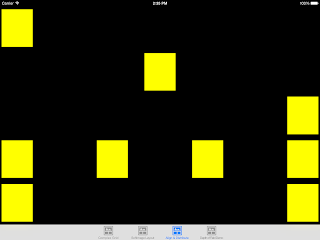
The GitHub project is a demo harness containing four separate implementations of Shinpuru Layout: Complex Grid, Softimage Layout and Depth of Field Demo discussed above and a very simple Align & Distribute which shows how child components can be left, centre or right aligned or distributed evenly:
To use Shinpuru Layout in your own project, you simply need to copy over two files: SLGroup.swift and SLControls.swift.
A thank you to Brian Gesiak for confirming the translation of the Japanese work Shinpuru which means 'simple'.
Shinpuru is an open source component and the full source code is available at my GitHub repository here. There's more work to do, but from my testing here, what's there is pretty stable and work well. Enjoy!